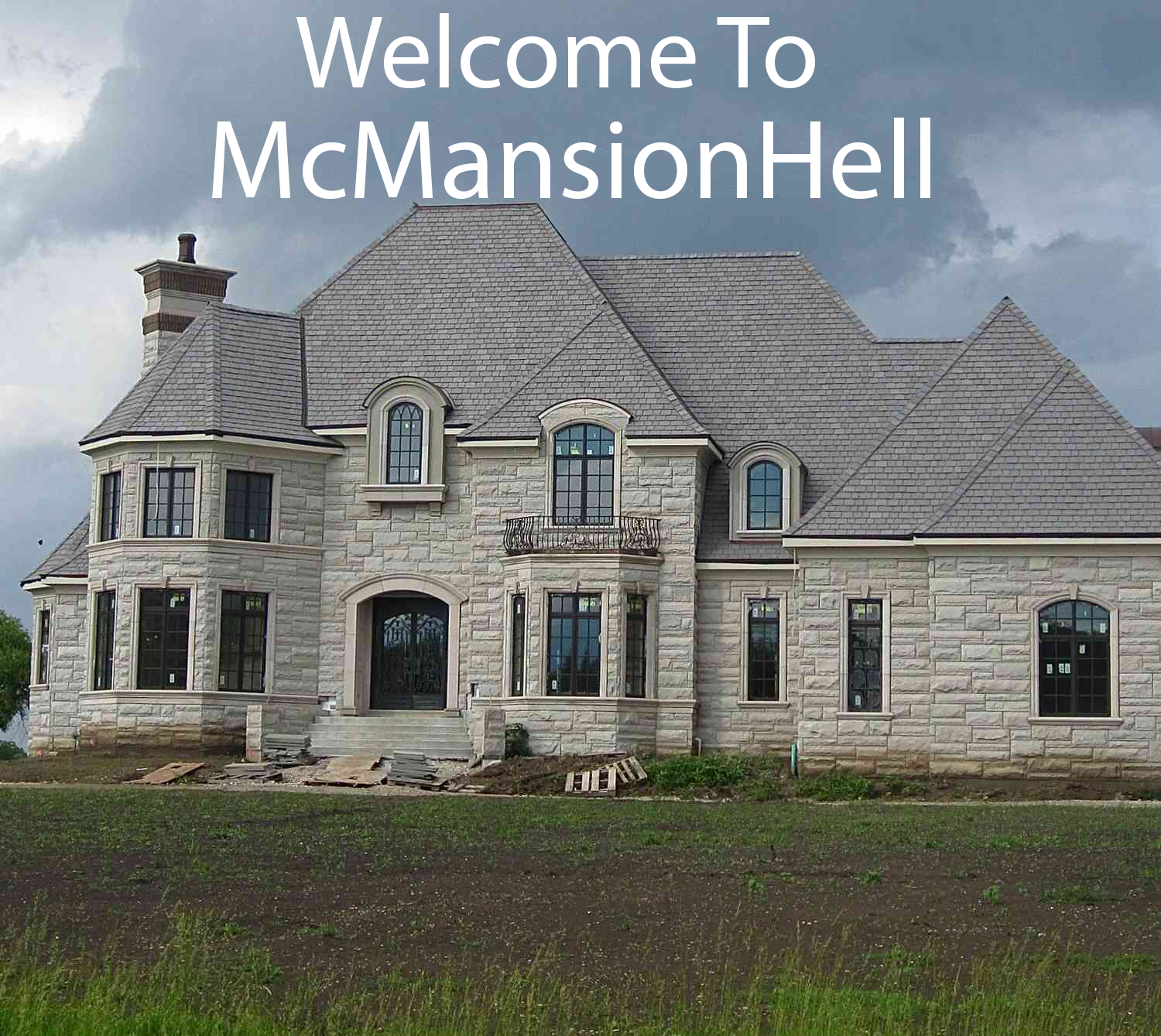
I really don’t like the interior on this one. XD It looked like naked plywood at first.
You must log in or # to comment.
This one’s interesting, if only for the wasted potential IMO. Someone was clearly going for the mountain lodge look architecturally, but it appears as if an interior decorator with a passion for ornate floral patterns got hold of it afterward, and then tried to make it fit the theme by picking only brown and tan colorways. The end result is chaotically busy and oppressively dark, which is a damn shame because architecturally it could have been rather spectacular.
A buyer with a clear vision and a lot of patience for wallpaper removal could make this into a really nice house, I think.
There is carpet in the bathroom…


