Hi, thank you everyone for the feedback. This release mostly is just added improvements that have been highly requested. 113 adds draft posts and comments as well as video playback for most video services. I’ve also added support for ::: spoiler tags ::: (although just a first iteration and I’m still playing with the styling), improved how communities and persons are fetched from remote instances (less API remote object not found errors) and some performance optimizations.
Changes
- Draft posts and comments
- inline video player (now muted and doesn’t pause other audio sources)
- better post truncation (ends on a word end when possible)
- Inbox no longer limited to the first page, added infinite scroll
- Post list now displays a small page header every 20 posts (clicking jumps to the top)
- Enabling full usernames (@instance) now uses the username and not the display name
- Fixed an issue where some comments weren’t showing up in large threads.
- post images now fade in (less flash)
- Fixed an issue where posting a comment would stay at the edit page
Links:
&
-kuroneko
Dude, really? How in the hell do you work this fast?
A lot of caffeine XD
Explains why you’re on buymeacoffee haha
Thank you for draft comments, I love you! And for full usernames. And finding the missing comments. Literally all the things that were making me crazy got addressed, you’re amazing. Please enjoy 5x coffee on me. 💕☕❤
Thank you for the support!
Sleep, n. A substitute for caffeine.
Connect has fast become my chosen lemmy app, thanks for the hard work!
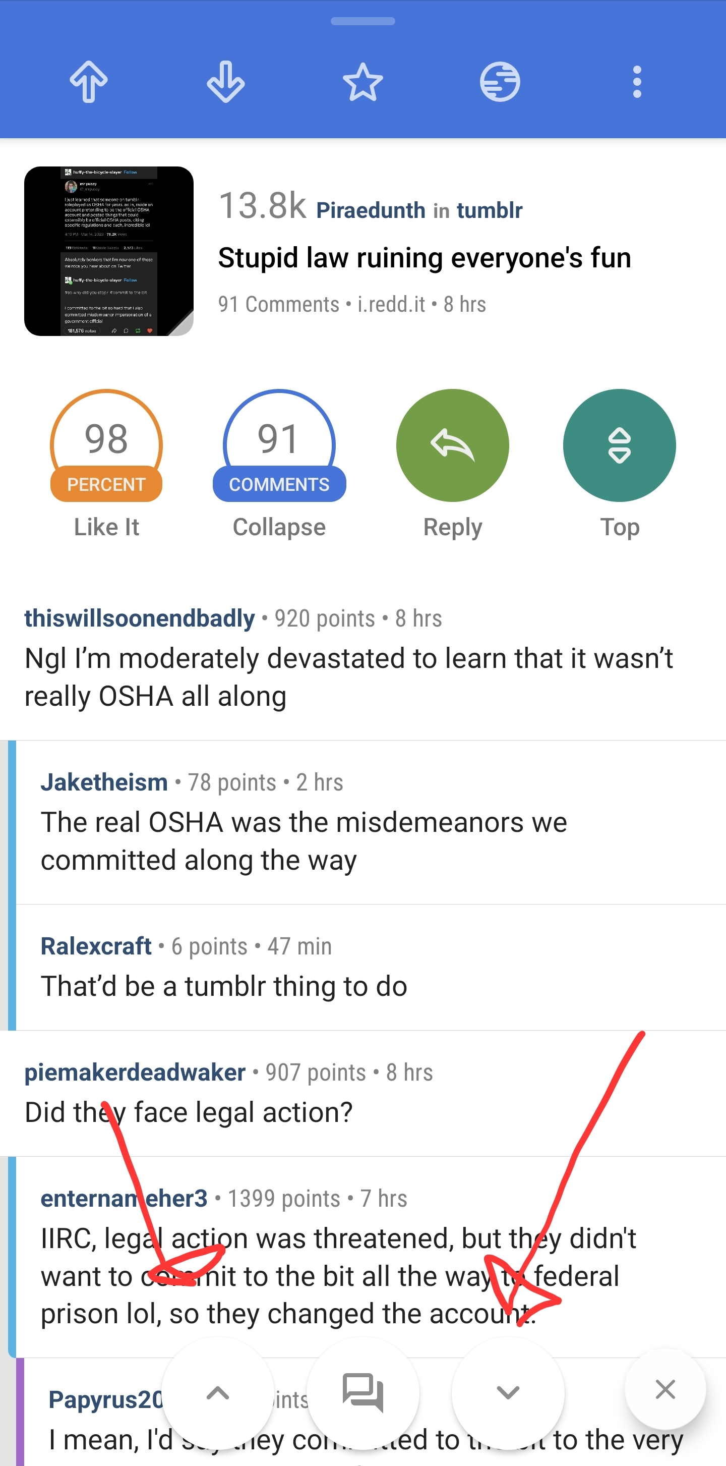
One thing I miss from Relay is the comment navigator buttons floating at the bottom, any chance of a feature like this?

Hi. Thanks for the feedback! I can take a stab at it. What does that second button do with the comments icon?

It brings up this search interface
- Threads will navigate between top comments
- Search word will ask for a search term and then navigate between comments with that term.
- Time will prompt user to input an amount time with a slider bar, navigation arrows then only look for comments that are newer than that time
- moderator searches for moderator comments.
Would also allow you to enable AMA mode, that one was neat

Actually never noticed that before. I would only use it occasionally for the search function.
Was great when AMAs were still good on reddit. Havent used it in a while tho
Wow that really would be great, definitely would be the last thing I’m looking for in the app! Do you have a way of donating to the app?
You can donate here
The rates of updates is wild. People like you are turning the fediverse dream into reality. Thank you.
Thanks for the fast updates.
One request I have is that for when opening web content, the title is just “Web”. I think it would be better to show a URL, or “Web - [URL]”, to double check that the loaded URL is the expected one. Maybe long press to copy the URL. Maybe a progress bar too.
Thanks again.
All good suggestions, thank you!
While we’re on the in-app browser topic, any chance the Android back button can act as a browser back button? E.g. You click a post link, and are in the in app browser and follow another link. The top back button will take you back to the post view, but the android back button just backs you up a browsed page.
Yeah I’ll take a look at that as well. Thanks!
Nice! Thanks. Love the app.
Awesome! Thanks for the hard work.
Alert
It works!
But the formatting feels wrong. The way lemmy has it on the web ui it shows “Alert”, and the “It works!” gets hidden. The whole thing is hidden on Connect, but I think they should behave the same way :)
With the implemented amoled theme it’s not possible to see somethings hidden there, as both the spoiler and the background are pitch black. So entire spoilered comments would just appear empty. Showing the “Alert” could help here as well. Otherwise is there a way to change the default hiding color slightly?
Good point, i had only tried it with dark mode!
Two things I miss from sync:
-
After hiding a post, a small popup that lasts for 10s allowing you to unhide it in case the swipe was a mistake
-
A section in your profile to see hidden posts in case you want to come back to something
Thanks! Fantastic app!
-
Have to say Connect has definitely become my goto app and I have nothing but praise for the dev. Just updated to latest and thoroughly enjoying it except for what is probably just a silly thing and that is the Page 1 Page 2 when scrolling. I know it may seem silly and nitt picking but for some reason it just seems to me that we have been without it till now and it just doesn’t add anything to using the app.
I will be downgrading to the previous version as I just prefer not to see that.
This is in no way meant as anything negative against the dev or how he wants things to be as it is their time and effort going into this and then allowing us to have it free.
Right my little ramble is over I will leave you all in peace now :)
Thank you for the feedback! I’ll add a setting to disable page headers.
hello! thank you for all your great work, the app has come such a long way in the ladt few months! is there a way to disable the page header every 20 posts in the settings ?
Great update as always!
Small request, would you consider adding a tablet optimized UI?
That’s the opposite of a small request, maintaining a second UI can easily double the work for devs
Thank you for all your hard work. Would it be possible to let users customise the
code blockcolours? I’m colourblind and find the default quite hard to read.And now there’s an option to turn off confirmation on exit. 😁
Hi, Is there a way to manually set the download path for all downloaded pictures and videos?
Awesome, especially the video player.
Hide posts above?


