Hi, this update is mostly focused on some performance updates to Image rendering and memory management. I stripped out the old plugin I had doing this and am now handling things a bit more manually. Hopefully this should improve the experience of long scrolling sessions. I did refactor a lot so if you see any bugs here please let me know! Large new additions in this release are URL domain filters, and video zoom. I’m starting work on settings import/export but it’s not ready just yet.
Added
- Added URL Domain filters
- Added video zoom (double tap, pinch)
- Added a link icon to posts without thumbnails
- Added None as a comment long press action
- Better handling when proxied comment resolve fails
Fixed
- Fixed voting on posts refreshing the video player
- Fixed some issues with image heights not fitting correctly
- Minor hotfix to change the link icon on posts to be centered and not left aligned
- Improved the list of subscriptions for large lists
- Fixed an issue where images would sometimes not free from memory
- Fixed photo view not expanding
- Fixed a small screen flash on image expand
- improved performance of large images
- All Snackbars now last for 5 seconds
- Fixed markdown not loading in some cases when it should
- URL confirmation prompt now also applies to external links
- Fixed an issue with switching accounts when uing an email to log in
- Fixed an issue with Spoiler tag sometimes not appearing
- shouldInstanceBlockIncludeUsers no longer defaults to on
- Fixed reply swipe gesture
- Improved freeing of memory in some cases for preloaded images
- Fixed comment navigator when showing all comments
- Create comment screen no longer has discard prompt if drafts are enabled
Thank you everyone for all of the support and suggestions, please keep them coming and we’ll continue to make Connect the best app for browsing Lemmy!
Links:
-kuroneko
Many thanks for your continued efforts. Connect is by far my favorite Lemmy client!
What’s that 5 second Snackbar thing?
It’s the messages at the bottom of the screen For example after hiding a post.
That one doesn’t seem to be working for me, I’ve got a Post Hidden message right now for over 30 seconds
Great app! Thank you for your dedication to this project.
deleted by creator
Thanks I’ll take a look!
deleted by creator
At least in list view, thumbnails seems to be stretched/squished to square, instead of being cropped or padded like they probably should be. Is that new or known?
I’ll take a look. Thanks for the feedback!
deleted by creator
I know its a connect group but other day this guy kept asking me to use sync. Can someone please list the pros and cons of using sync. For me connect is okay but I was curious why people were asking me to use sync.
It’s a bit more polished and less janky, as it was an established Reddit app that got ported over. I haven’t been too impressed with the features, and since it doesn’t have “horizontal swipe for next post”, I haven’t used it much. You should try for yourself though. I tried half a dozen Lemmy apps before settling on Connect.
Same. I think i’ll just stick with connect. Thanks.
I fully don’t get sync. It’s drowned in ads (or, if you have custom DNS, full of endless black placeholders for ads), and feature-wise just like Connect. I haven’t checked for a while, but I remember people asking for stuff that was already here on Connect.
Hello!
I’m sure this is my own fault, but I seem to be accidentally hiding some posts. How do I unhide them?
Is it from swipe-to-hide? You can adjust your swipe settings
Thank you
Thanks for the awesome work on the app and taking all the feedback everyone has to make the app the best one out there. It’s great and keeps getting better everyday.
Removed by mod
There’s a new bug which I first noticed in 1.0.150:
Using horizontal swipe to navigate between posts often yields a different list (or at least a different order) than scrolling through posts.
Anyone else notice similar behavior?
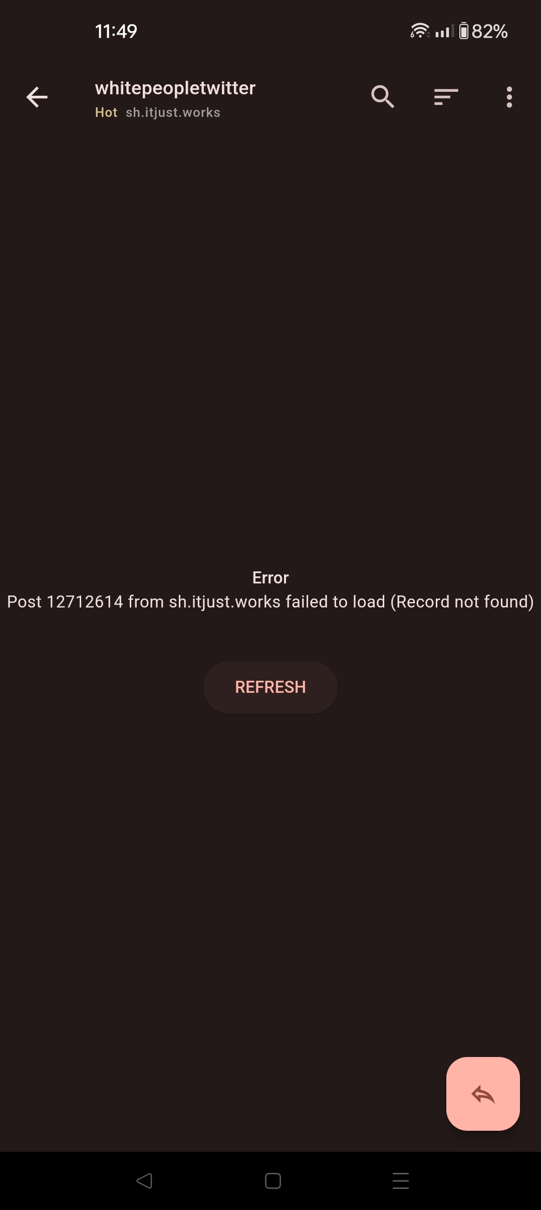
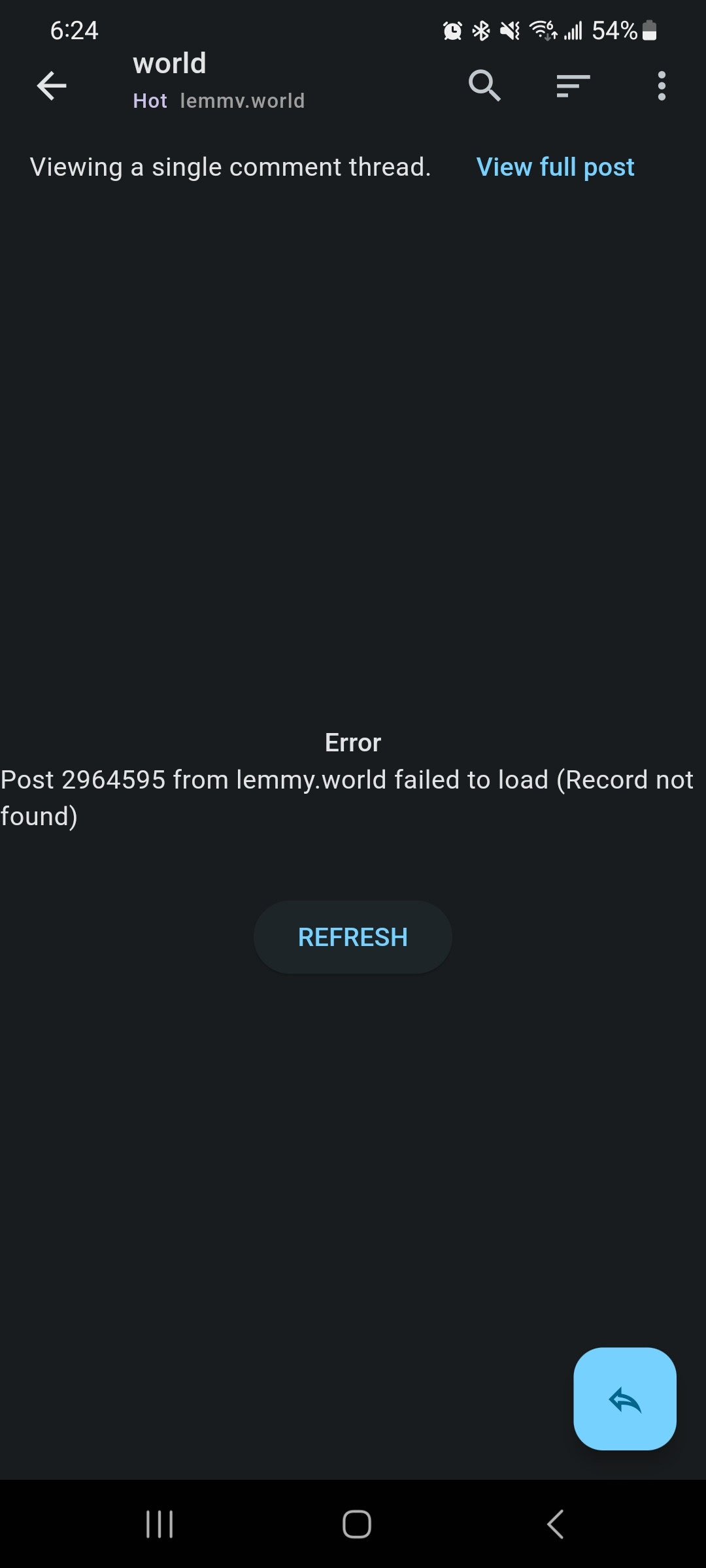
Clicking on many of the links from All presents this error after updating. Is there anything that I should be doing or is it specific to Connect?

Are you on version 160?
The most current version that was available to me at the time was 159. I have 160 now and it seems to be functioning correctly!
I’m on 160 and it’s still not working for me.

Is that on all posts from the All feed or only specific ones? You could try 163 on the beta channel but I’m not sure that will fix the issue.
It seems to be for all of them, but I’m wondering now since I spend most of my time on the all feed. The way I’ve been responding to comments is by finding the post and then scrolling down to find my comment. I’ll try 163 and let you know
Update: 163 works! Thanks :)
Not sure if it was this version or last but I just noticed a slider for text font size was added. Thank you for this, It works great!
Hello hardworking dev, I was wondering if you are planning to add a follow account feature?, it would be awesome to have it in your app, I’m still using it since the boom of Lemmy like 7 months ago and it is better everyday, thanks for the hardworking 👍👍.
deleted by creator


