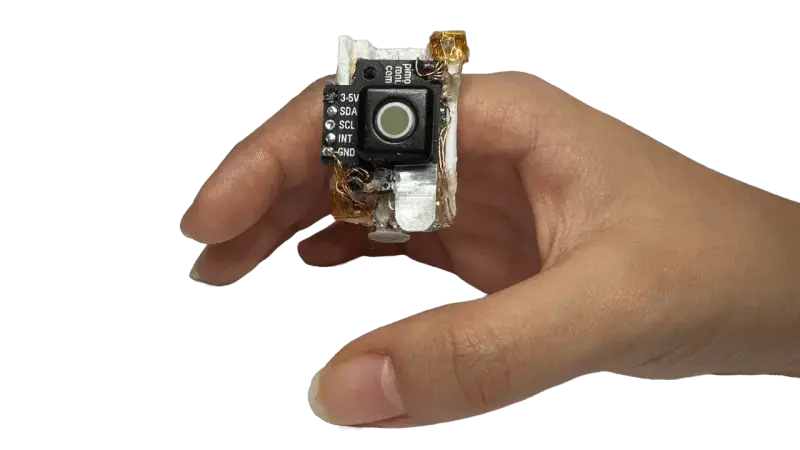
This doesn’t look ergonomic at all. It looks like instead of potential wrist issues, you get thumb issues.
I built something like this in design school back in 2015 using an Arduino. I stopped designing it because that’s exactly what I got: thumb issues.
Try rubbing the base segment of your index finger with your thumb for any length of time, it quickly becomes unpleasant.
It looks like its goal is to make everything less comfortable, not more.
comfort is futile
This looks like a Borg engagement ring.
Well this is dumb as fuck.
The keyboard looks unusable. Even in her demo there were several mistakes. Handwriting recognition one letter at a time is slow, tedious, and error prone. An on screen keyboard would be better.
The mouse functionality looks interesting though. I want to see how precise it is. Maybe use the button to adjust sensitivity.
As others have said, it doesn’t seem very ergonomic. By moving the ring to the tip the index finger would work but at that point I might as well have a Joy-con.
I think it’s cool and needs more prototyping. A smaller size would be the next logical step.
Would be interesting to be paired up with something like Google Glass or Apple Vision. That way you can control something without having having to lift your hand like you’re trying to use your Jedi powers to convince someone that these aren’t the droids they are looking for.

this looks like a shittier, less comfortable version of those handheld trackballs from the early 2000s.
This actually kinda reminds me of PointCtrl used in VR mouse control for flight sims. It may look uncomfortable but if it works similar to it it’s actually incredibly intuitive to use
Would be neat for pinephone with keyboard but otherwise not super useful. Cool hobby project for sure.


