- cross-posted to:
- [email protected]

- cross-posted to:
- [email protected]
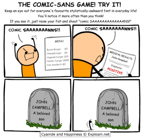
Seriously, though, Comic Sans was originally designed to be legible at the smallest possible font size, and the lack of hard lines makes it easier to read!
You must log in or register to comment.
⚠️ I have reported this post to the proper authorities.
Title is misleading, it’s a monospaced derivative of Comic Sans that’s actually nice, not actual Conic Sans.
Conic Sans is the hyperbolic version of Comic Sans
I miss RES’s context feature now. Thank god this thread wasn’t too long, so I was able to find my comment you replied to in it in a reasonable amount of time.
Oh no now I want to build a whole Arch rice around that font.
…no that’s not enough.
we need ComicSansOS
Holy man! If you ever do that. Please post! On unix porn as well!
Wow, poor comic sans didn’t deserve all the hate it got
I tried that this morning at work, as a joke.
It was still there when I got off.
undefined> Wingdings
After two days, what do you think?
Still using Comic Mono, I really like it.
I’d just like to slightly increase the letter spacing. Some portions of code felt a bit too dense. Maybe I’ll try to tweak that after my vacation (as of today, 8 days without a computer)
Wonderful! I also installed Comic Mono yesterday kept it until now. So far so good. Yeah you are right, sometimes the code feels a little bit dense. If you do something about that, please give us an update.
BTW enjoy your vacation!
Giggity.
I will forever believe the comic sans hate is one of the internet’s seemingly random circlejerks, like hating Imagine Dragons.
There were legitimate reasons from a design standpoint. It’s badly balanced, the spacing is inconsistent…and it was everywhere.
Funny enough, I suspect what makes it a badly designed font might be why some people with dyslexia have an easier time reading with it. The badly balanced, poor spacing, probably made the letters in the font more distinguishable from one another.
If you (or anyone else that’s interested) have the time, I think this article, “Why You Hate Comic Sans,” goes over all of it pretty well.
I’ve heard that too - part of the issue with dyslexia is that it’s easy to flip the letters around in your head, when none of the letters look the same, it makes it easier to read. Open Dyslexia is another one that does something similar.
I recently read a review of 1990s pop aesthetics, and it was probably intentional for reasons that resonate with us again. In the 90s, with the advent of omnipresent computers, organic, amateurish handwriting became really popular, and I think that’s what comic sans is good at looking like.
i already do that while playing undertale so no losses
I…don’t hate it? Why am I not horribly offended by this?
Same thoughts here. Went in expecting to hate it instantly and found that it sort of looked nice.
Yeah, this has me intrigued. May try it out in vscode just for a lark. Possibly actually will be easier to read with some nice shapes…
I feel the same way. I hate that Iike it and am now going to try it.
This has me rethinking like two decades of coding. wtf.
I think some of the reason might be that Comic sans used to have really bad kerning. But with a mono font it is not really an issue.
I’ve coded with comic neue https://comicneue.com/ over the last few years. I would definitely recommend it.
That’s amazing, I love it. Thanks for linking that!
My original intention was to come here and proclaim that you’re a heretic. Having looked at it for a moment, I think that you’re onto something here…
same here… just right now downloading the font, thinking if I don’t at least give it a try, I’ll forever wonder what it’d be like…
The difference is that Comic Mono is monospaced, which gets rid of Comic Sans’s horrible kerning.
If you like that, check out Recursive Sans & Mono
I wouldn’t pick it over Fira Code but it has a bit of whimsy to it that reminds me of Comic Mono.
Really dig that for a new-wave ui
That is so cool. I have no idea what to use it for but I just spent 10 minutes playing with the sliders.
Ooh, I like that.
Comic Sans is actually really good for dyslexic people. It’s why I usually use Comic Sans or Comic Neue when I print stuff out for my dad.
There’s also Dyslexie and a similar open source version: https://opendyslexic.org/
That looks sooooooo nice
Who knew? Just make it monospace.
Fantasque Sans Mono
Haha, this is one and only one thing in my life that I don’t want to change, never ever :D
Staring at code for 8 hrs a day, my eyes thank you.
I came here to get mad but comic sans monospaced looks really good. I’m impressed. I might switch my IDE to this.
Reducing the font-size makes it look pretty great.
Yeah but does it have ligatures? That’s my hard pass on coding fonts.
Looks to me like it has a ligature that visually appears as two separate characters but are spaced to be close together. See the
<=in the code examples on the page.
Seriously, for coding I use daily Fantasque Sans Mono, which is based on Comic Sans. I love it.
It’s interesting that you added serifs and monospacing to a sans serif font. It’s almost like comic sans but with all the things that make it comic sans removed.
Well it is Comic Mono after all, not Comic Sans Mono :)