You must log in or # to comment.
What an overt pos
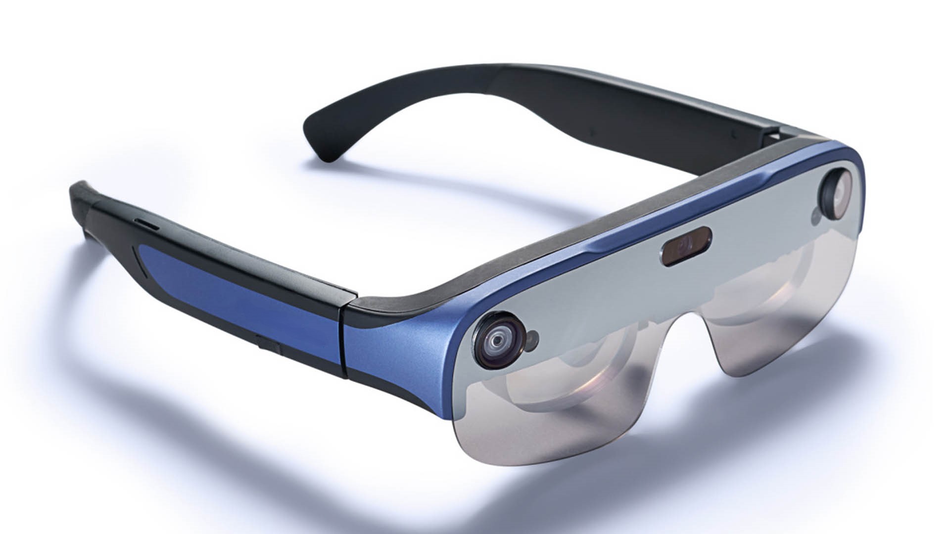
I am pretty sure that’s a mockup (likely AI generated).
But nevertheless, isn’t this true of all AR glasses?
Nah Zack Freedman’s HUD does not look like a POS, it looks like a utilitarian compromise between form and function.
If that mockup is anywhere near what the product looks like, it looks like it has a ton of useless plastic.
I am not familiar with Zack Freedman’s work, but a quick review of via image search honestly does not inspire confidence.
That being said, my tastes are limited to device design where you can’t tell the difference from a normal pair of medical glasses.


